The first time I chose a wall color completely on my own, with no advice and no second opinion, I was convinced I had nailed it. I picked a shade called Warm Stone from a budget paint brand thinking it would look elegant and understated. It did not. It looked exactly like the inside of a biscuit tin. Every single photo taken in that room had a strange yellow beige cast over everything and no wall color ideas I tried to layer over it with decor could fix what was fundamentally a bad base color choice. Visitors were kind enough not to say anything.
Since then I’ve repainted five rooms across two houses, learned things I wish someone had told me before I spent a Saturday on a ladder, and developed opinions about wall colour that I hold with slightly unreasonable confidence. This is everything I know the practical stuff the colour psychology the things that tripped me up, and the approaches that changed how my home feels to live in.
Why your room is lying to you about colour
The most important thing I learned and the one nobody tells you upfront is that a colour on a paint chart has almost nothing to do with how that colour will look on your wall. The same shade can appear completely different depending on which direction your room faces, how much natural light it gets, what time of day you’re looking at it, and what’s already in the room.
North facing rooms get cool indirect daylight. Blues look bluer greys look greener and whites look positively frosty. South facing rooms are bathed in warm direct light for much of the day the same grey that looked elegant in a north facing space will look almost beige there.
I painted my hallway (north facing, no windows at the far end) in a shade I’d seen in a south facing kitchen renovation online. What looked like a sophisticated warm taupe in the reference photos read as a slightly grubby brown on my walls. The light transformed it completely.
Before you commit to any colour get the tester pot. Paint a section at least the size of an A3 sheet. Look at it at 8am noon and 9pm under your actual lamps. Only then buy the full tin.
The colour families and where they actually work
Warm whites and off whites
Elephant’s Breath, String, Cornforth White
Forgiving versatile and much warmer than pure white. The go to for rented spaces or rooms where you want a clean palette without coldness.
Warm and green leaning greys
Mole’s Breath, Purbeck Stone, Pavilion Gray
The most liveable neutrals. Add depth without drama. Work in almost every room and don’t date quickly.
Sage and forest greens
Mizzle, Calke Green, Studio Green
Organic grounding and currently having a very deserved moment. Work in kitchens living rooms and bedrooms equally well.
Deep blues and blue greens
Hague Blue, Stiffkey Blue, Inchyra Blue
Dramatic and rich. Best on a single feature wall or in a room with good natural light. Look incredible with brass and warm wood.
Terracotta and warm clay
Red Earth, Etruscan Red, Dead Salmon
Earthy, unexpected, and incredibly warm in lamplight. A divisive choice that converts almost everyone who tries it.
Deep plum and aubergine
Pelt, Brassica, Vardo
For those willing to commit. Cocooning atmospheric and beautiful in lamplight. Not for the faint hearted but deeply rewarding.
Matching colour to the room a room by room guide
Living room Go warmer than you think
When it comes to wall color ideas for your living room, always go a little warmer than you think you need to. This room is used mostly in the evenings under artificial light, which means cool greys and pale blues tend to wash out and look flat. Warm taupes, sage greens, and earthy neutrals on the other hand reward you every single time you switch a lamp on. The room instantly feels cozy, inviting, and alive.
Bedroom Think about morning and evening
Your bedroom gets used at both ends of the day so your wall color ideas need to work in two very different kinds of light. Cooler tones like soft green, muted lavender, and dusty blue feel calm and gentle in the morning light. Deep and rich colors feel cocooning and restful in the evening. If you are unsure which direction to go, mid tones do both beautifully and are a safe and smart choice.
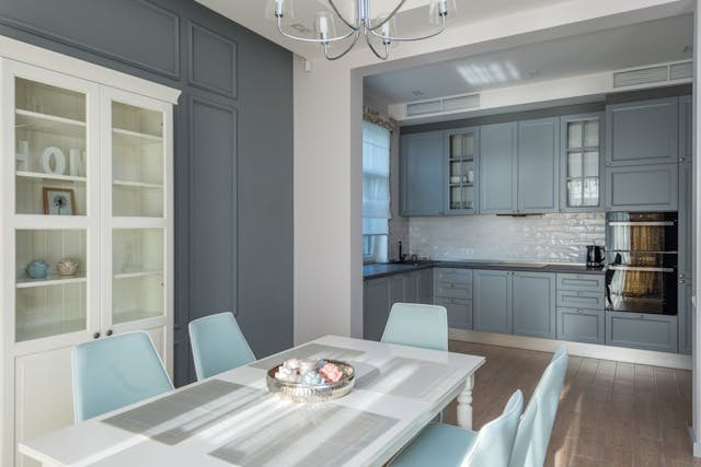
Kitchen Embrace contrast
Kitchens actually handle bolder wall color ideas really well because the cabinetry and worktops naturally break up the wall space. Deep green, navy, or terracotta on an upper wall or splashback zone can look incredibly striking without feeling overwhelming or too heavy. Do not be afraid to be a little bolder here than you would in other rooms.
Hallway Go darker than expected
Hallways are transition spaces people don’t linger. A bold dark colour here creates drama without commitment. It also makes adjacent rooms feel brighter by comparison when you step through the door.
Bathroom Light dependence is high
Bathrooms vary wildly. A windowless bathroom can handle dark walls with dramatic results. A bright ensuite looks beautiful in soft sage or warm white. The light situation dictates everything here.
Home office Avoid over stimulating shades
This is where green shades earn their reputation. Soft sage, muted olive, and even deep forest green have been shown to support concentration better than the stark white most people default to.
How to choose a wall colour without getting it wrong
Identify your room’s light direction first
One of the most important and often overlooked wall color ideas is to start by identifying which direction your room faces before choosing anything else. North facing rooms receive cooler light so you will want to choose warmer undertones to compensate, think creams, warm greys, and soft terracottas. South facing rooms give you much more freedom since the sunlight does the warming work for you naturally. East facing rooms get beautiful bright light in the morning but dim down considerably in the afternoon, so pick a color that holds up well in both. West facing rooms can feel flat in the morning but come alive with a gorgeous warm glow in the evening, making them perfect for rich and warm tones that truly shine after around 4pm.
Pin down your undertone preference
Every color has an undertone hiding underneath it and understanding this is one of the most useful wall color ideas you can take on board. A grey for example can have pink, blue, green, or yellow undertones beneath the surface. This is exactly why two greys that look almost identical on a paint chart can look completely different once they are up on your wall next to each other. Decide early on whether you want your room to lean warm with red, yellow, or orange undertones, or cool with blue, green, or purple undertones, and then use that preference to filter your choices down.
Shortlist three to five colors and buy testers
Before spending any money on testers, use apps like the Farrow and Ball, Little Greene, or Dulux color visualizer to quickly eliminate any obvious mismatches. Then buy physical testers for your final shortlisted candidates because relying on a screen alone will almost always let you down. Paint large swatches directly onto your wall, at least A3 size or bigger, and never use the card test where you hold a small painted piece of card up to the wall. It is one of those wall color ideas that sounds fine in theory but is notoriously unreliable in practice and has led many people to make costly color mistakes.
Buy the right finish for the right room
Colour choice gets all the attention, but paint finish matters enormously. The wrong sheen level will undermine even a perfect colour choice. See the guide below.
One wall vs four walls when to commit and when not to
The feature wall is a hotly debated topic in wall color ideas. My honest view is that it only makes sense when the color cannot carry all four walls, or when there is an obvious focal point like a chimney breast or the wall behind your bed. Otherwise it usually just reads as timid and uncommitted.
If you genuinely love the color, paint all four walls. The room will feel more cohesive and impactful for it. Every dramatic transformation you see in design photography is almost always a four wall commitment. So trust the color and go all in.
About Umer Aziz
Umer Aziz is a dedicated content writer and blogger with
a deep interest in [HOME DECOR]. He believes in delivering accurate, practical,
and reader friendly information.
Learn more: [https://cozyhomedecoru.com/about/]
Contact: [contact@cozyhomedecoru.com]