Everything I wish someone had told me about choosing room color schemes before I wasted four weekends and a lot of paint. The first color I picked was called Whisper White. It sounded dreamy. On the swatch card at the hardware store, it looked like the perfect soft, airy neutral just a breath of warmth nothing too harsh. I painted my entire living room with it on a Saturday afternoon and stood back to admire it. It looked like a hospital waiting room. Not crisp no clean.
I repainted three more times after that once with a green that turned weirdly blue in the evening light once with a terracotta that made the whole room feel like the inside of a clay pot and finally with a dusty sage that I still love to this day. Each round taught me something. So if you’re standing in the paint aisle right now staring at 200 shades of beige and feeling mildly panicked this one’s for you.
Why Room Color Schemes Feel So Overwhelming
Here’s the thing nobody tells you upfront: paint colors don’t exist in isolation. The color you see on that tiny swatch card is being lit by fluorescent store lighting, surrounded by hundreds of other colors, and sitting against a white background. Picking right color scheme can change the whole vibe of room. Bring it home, and it’s a completely different animal. It’s affected by your natural light your flooring your furniture the ceiling height all of it.
The Main Color Scheme Types
Monochromatic: the one I always recommend to beginners
Pick a color you love let’s say a soft sage green. Then use three versions of it: a very light tint for the walls, a mid tone for textiles like curtains or cushions and a deeper shade for an accent piece like a vase or a chair. You can’t really go wrong. It looks intentional and pulled together without requiring you to juggle multiple colors at once.
Analogous: my personal favourite
This is where you pick two or three colors that sit next to each other on the color wheel like sage green warm olive and soft yellow. They all get along naturally. My current living room uses this approach sage wall swarm linen sofa mustard throw cushions. It took me a while to land on it but the result feels amazing.
Complementary: proceed with caution
Blue and orange. Green and red. Purple and yellow. These opposites create real visual pop but in a full room they can feel exhausting. The trick is to use one as your dominant color and the other only as small accents (terracotta pots a rust colored throw). Keep the ratio somewhere around 80/20 and you’re fine.
How to Actually Choose Your Scheme
Start with what you already own
Look at your largest fixed items sofa rug flooring. These aren’t changing. Your color scheme has to work with them not despite them.
Identify your room’s light quality
North facing rooms get cool grey light. South facing rooms get warm golden light. Cool light makes warm colors cozy warm light can make some colors look yellow or muddy. Know which way your room faces before committing.
Pick your dominant color first
This is usually the wall color and it takes up the most visual space. Choose something you can live with not the most exciting color but the most liveable one.
Add a secondary color
This goes on bigger soft furnishings curtains a rug the sofa if it’s neutral. It should complement your dominant color without competing.
Test paint samples on your actual wall
Buy the small sample pots. Paint two large patches on different walls one that gets morning light one that gets evening light. Live with it for three days before deciding.
Room by Room Considerations
Not every scheme works in every room. Here’s what I’ve learned from doing this across multiple spaces my own home and a few friends’ as well.
Living rooms
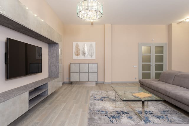
These need to feel welcoming but not overwhelming. Warm neutrals are practically foolproof. If you want color go for muted sophisticated versions dusty pink sage warm terracotta rather than saturated ones. Too bright colors in a living room feel like you’ve walked into a show home and never relaxed.
Bedrooms
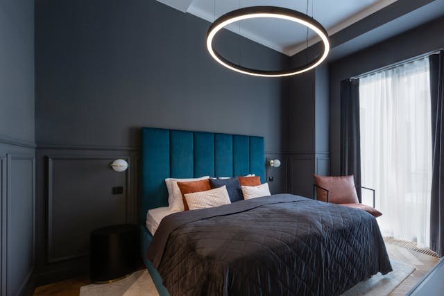
Cooler tones are generally great for promoting rest and relaxation in a bedroom. Think soft blues, misty greens, and lavender tinged greys. I personally painted my bedroom a color called Mizzle by Farrow and Ball, which is a beautiful and complex mix of green and grey, and it genuinely made the room feel so much more calm and restful. Dark and moody colors can also work really well in bedrooms, as long as your room gets a decent amount of natural light during the day. Deep navy, forest green, and charcoal are all wonderful choices. Rather than feeling dark or suffocating, these shades create a warm and cocooning atmosphere that feels incredibly cozy and comfortable to sleep in.
Kitchens
White and cream will always be classics here but off white not stark white reads as warmer and more human. Navy blue is having a serious moment in kitchen cabinetry and I think it works because it’s strong enough to hold its own against all the stainless steel and hard surfaces. If you have an open plan kitchen living space the color needs to work across both zones either paint them the same or make sure they’re clearly in the same family.
Mistakes I Made (So You Don’t Have To)
- Choosing paint color based on the swatch in the store without testing it at home first. The lighting in hardware stores is completely different from your home.
- Ignoring the undertones. A grey wall can go green, blue, or purple depending on the light. Always look at the undertone in the name or code most paint brands publish this info.
- Matching the wall color too closely to one item in the room. My terracotta phase I matched the wall to my terracotta pots and it ended up looking like everything was the same thing. You want harmony not monotony.
- Forgetting about the ceiling and trim. A stark white ceiling against a warm wall creates a harsh cut. Try a slightly warmer off white or tint the ceiling very lightly with your wall color it makes the room feel more finished.
- Choosing the finish without thinking it through. Matte looks beautiful but marks easily in high traffic areas. Eggshell is more practical. Gloss is durable but unforgiving on uneven walls.
A Few Combinations I Keep Coming Back To
Over time I have come across certain room color scheme combinations that just consistently work, no matter the style or size of the space. Here are some of my favorites:
- Warm white walls with navy accents and natural wood tones make for a room color scheme that feels timeless without ever looking boring.
- Dusty pink paired with warm grey and brass creates a room color scheme that feels sophisticated and elegant without trying too hard.
- Sage green combined with cream, terracotta, and natural linen gives you an earthy, textured, and beautifully grounded room color scheme.
- Soft charcoal with warm off white, natural rattan, and muted gold is a room color scheme that feels calm, warm, and quietly stylish.
- Deep teal with soft copper, warm wood, and cream creates a rich and striking room color scheme that still feels completely balanced and easy to live with.
None of these are new or groundbreaking ideas, but they work time and time again because the relationships between the colors are so well balanced. There is always a warm element softening a cool one, or a neutral tone giving the eye somewhere to rest and breathe.
About Umer Aziz
Umer Aziz is a dedicated content writer and blogger with
a deep interest in [HOME DECOR]. He believes in delivering accurate, practical,
and reader friendly information.
Learn more: [https://cozyhomedecoru.com/about/]
Contact: [contact@cozyhomedecoru.com]